Jeremiah Alalade
Available for workI design and engineer softwares.
Previously, I held various roles at startups.
I consider Nigeria as current home
I highlight curiosity as a personal quality.
I strongly believe that you can do great things from a small place.
Last visitor:

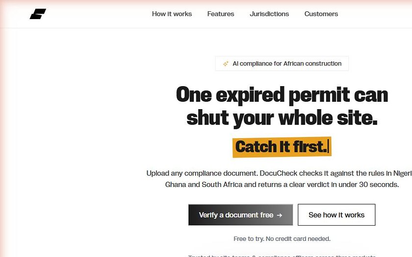
One expired permit can shut down an entire construction site. Not because anyone was careless, but because compliance still lives on spreadsheets, and a certificate that lapsed in March doesn't announce itself until an inspector turns up in June. DocuCheck reads the document instead. Upload a permit, a scan, or a photo taken in bad light on site, and it comes back with pass, warning or fail in plain English, in under thirty seconds. The hard part was never the AI. It was the rulebooks. COREN and NESREA in Nigeria, EPA and LUSPA in Ghana, NHBRC and SANS 10400 in South Africa. No existing tool encodes any of that, which is exactly why those documents still get checked by hand, or not at all.
Product design / AI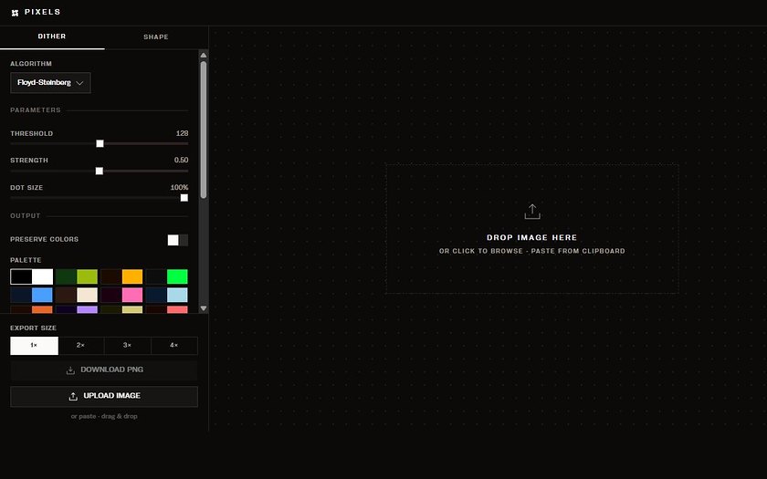
I wanted to dither an image and every tool I found wanted me to upload it somewhere first. For a photo I had not published yet, that felt like the wrong trade. So Pixels does all of it in the browser. Nothing leaves your machine. Six algorithms: Floyd-Steinberg, Atkinson, Bayer, Stucki, Burkes, Sierra. Threshold, strength and dot size to push around, a two colour palette you set yourself, then noise, vignette, glitch and chromatic aberration on top if you want to ruin it properly. Drop, paste or browse an image in. Export at up to 4x. No account, no upload, no waiting.
Browser tool / Creative coding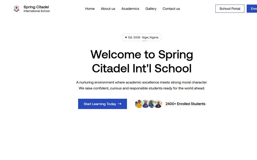
A school running since 2008 with nothing online a parent could judge it by. A Facebook page and word of mouth in Minna, and that was it. Parents ask the same three things before they enrol: what does this place actually stand for, how do the students do, and how do I start. So the site answers those in that order and then gets out of the way. It also has to load on a bad connection, on a phone, on the first try. That shaped more decisions than anything aesthetic did.
Web design / Development
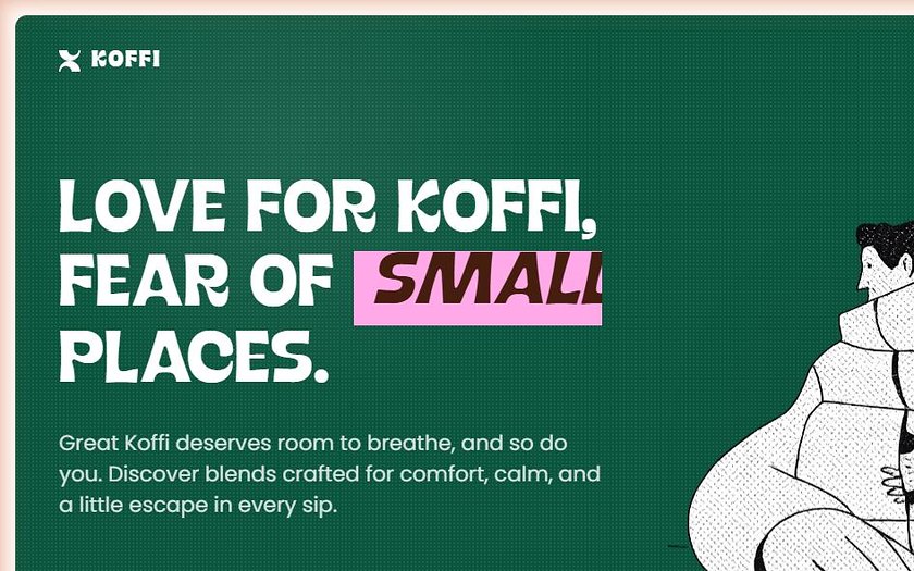
Love for Koffi, fear of small places. That line came first and the whole page exists to earn it. Coffee brands crowd the frame with beans and steam and hands wrapped around mugs. This one leaves space instead, because room to breathe is the actual promise, and a layout can make that argument better than another sentence of copy can.
Brand / Landing page
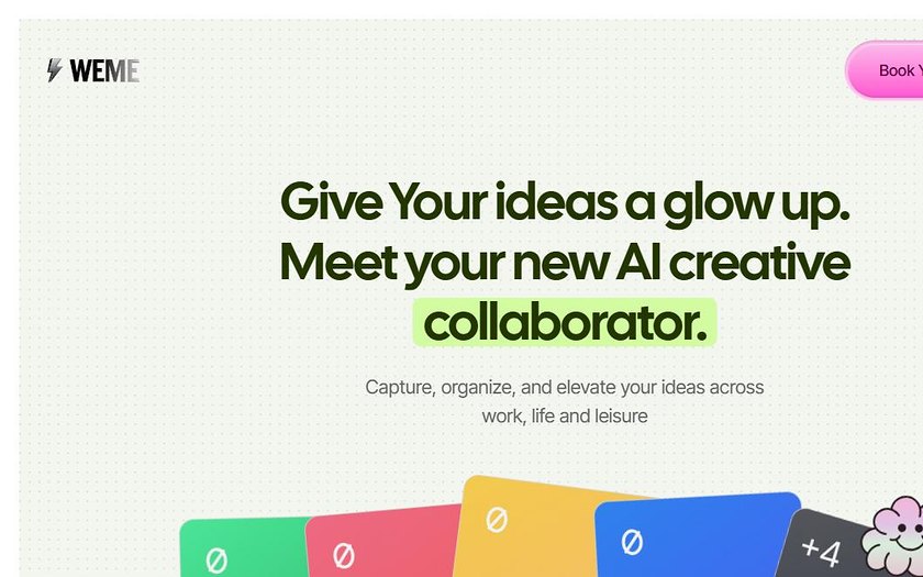
Selling something abstract is where landing pages give up and reach for a photo of someone smiling at a laptop. Weme captures and organises ideas across work, life and everything in between, which means there is no product shot to lean on. So the page had to make an invisible thing feel like something you could hold, without overpromising what it does.
Product / Landing page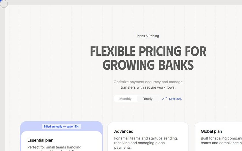
Pricing pages are where clarity matters most and gets designed least. Three tiers for a payments product, a monthly and yearly toggle, and a FAQ underneath answering the things people actually email support about. The only test that counts is whether you can compare the plans without reading anything twice.
UI / Pricing page
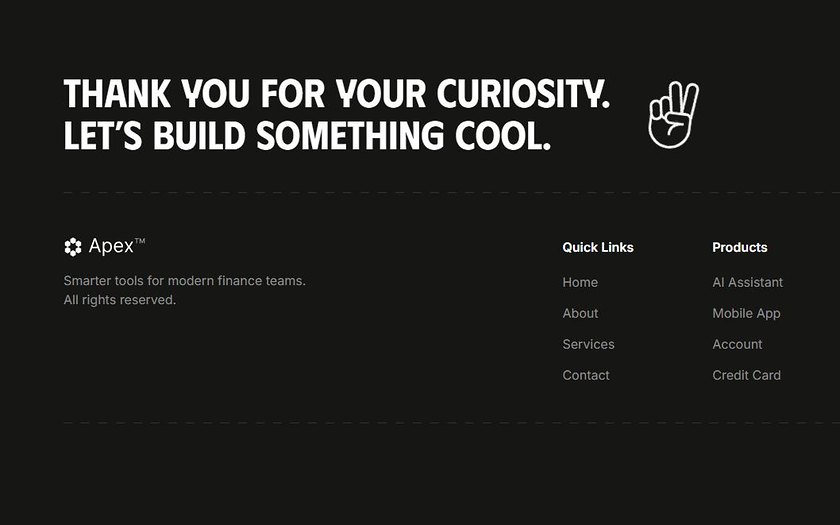
The footer is the part of the page everyone leaves until last, so I started there on purpose. Oversized type carries the sign off, thank you for your curiosity, let's build something cool, and the link columns sit underneath without competing with it. Most footers are a dumping ground. This one had to feel like an ending.
UI / Footer section
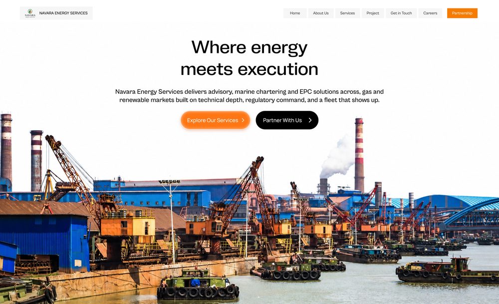
Navara Energy Services
Website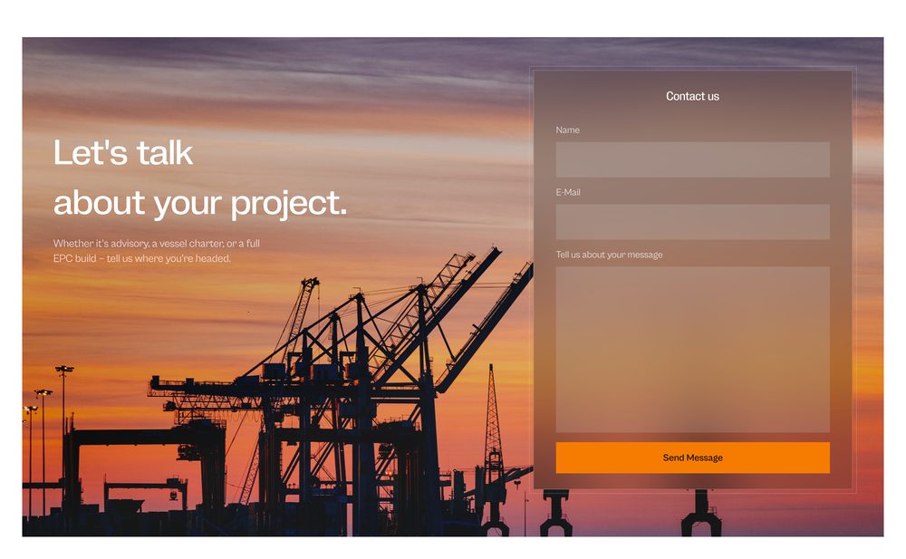
Navara Energy Services — Contact
Website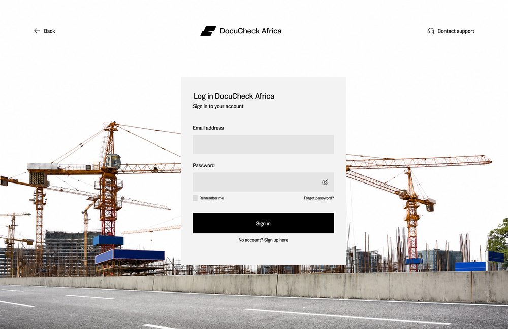
DocuCheck Africa — Sign in
Login screen for the DocuCheck Africa product, set against a construction-site backdrop so the auth flow still feels like part of the brand rather than a generic form.
Web App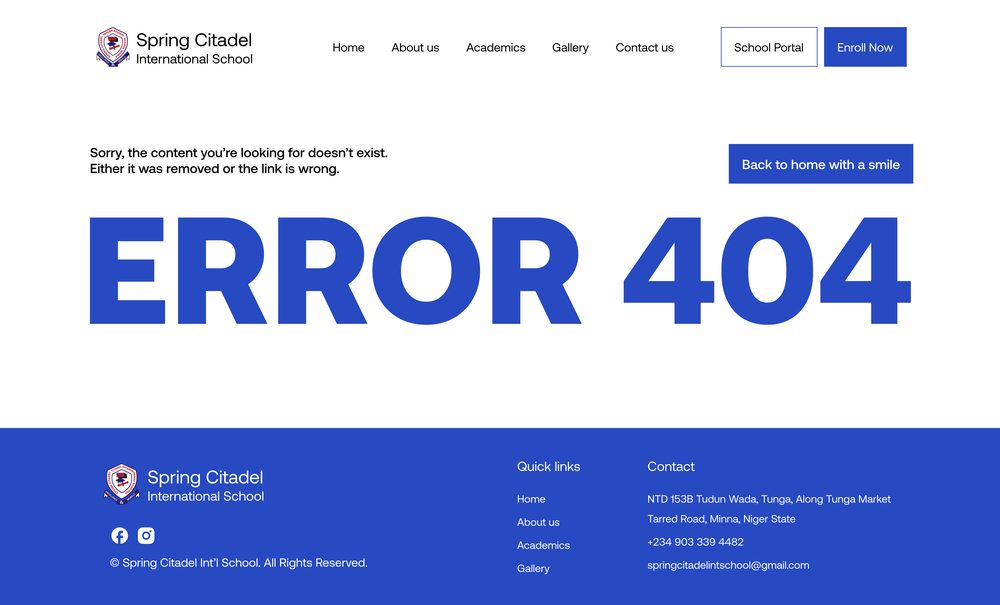
Spring Citadel — 404 page
A not-found page that still does its job: plain explanation up top, a way back home on the right, and an oversized 404 so the mistake reads instantly.
Website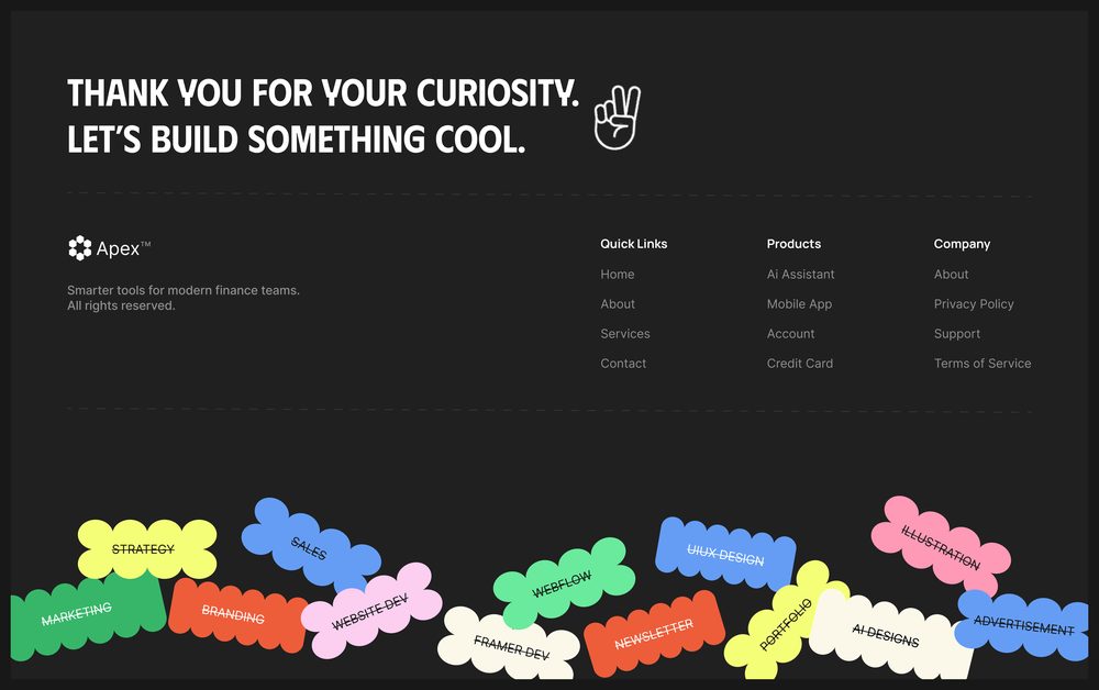
Apex — Footer
Website
Super neat guestbook. Very nostalgic too. Put a smile on my face.
Your work inspires me. Read a few of the writeups and the detail is unreal.
LikandoVisit fromZambiaThank you for visiting my site. You have a cool website and the guestbook is even better.
LeonVisit fromIceland